Grocery Shopping Website and Application
An online grocery store allows online ordering, or a standalone e-commerce service that includes grocery items.

Project Overview
About the project:
A Grocery shopping project is a platform where customers can order and purchase groceries online. Products can be tracked by customers until they are delivered to their doorsteps. In addition, customers can view different products with their information so they can choose the best one.
Project goal:
To create a simple and quick interface for website and application to reduce users' confusion. Also users don’t need to go shopping in person so it’s time-saving.
User goal:
To purchase affordable with quick and on time access to the fresh range of groceries
Business goal:
To Increase the number of customers and give awareness to users about the benefits of online shopping.
Duration:
12 weeks, November 2022
Team Members:
Self Directed, with feedback from the peers
My Role:
UI Design, UX Design, Intraction Design, UX Research, Wireframing, Prototyping, Useability Testing
Tools:
Figma, Adobe Illustrator, Adobe Photoshop
Project Timeline
Problem Statement
In this contemporary world, it is usual that people always in a rush and people don’t have enough time to buy grocery items in different store. In addition, existing applications or online stores have some deficiencies that most people prefer not to use. Therefore, they need a simple, user-friendly and online store based on a mobile screen and website with practical features.
My Process
Competitor Analysis
a competitive research is an overview of your competitors' strengths and weaknesses. These audits are used to collect information about what the competition's doing, including the techniques that are working and the ones that need improvement. These insights also helped me identify any gaps in features that my grocery store Too might address. I analyzed 3 direct competitors as shown below.
User Research
User Survey:
After I had some initial understanding of the user’s pain points, a user survey was conducted to figure out what most people think about buying groceries from online shops. This survey allowed me to hear from a large number of users.I conducted a survey which includes a mix of quantitative and qualitative questions. Therefore, this survey helps me to understand what most people think about buying groceries online.
- How often do you usually buy groceries online? Daily/Weekly/Monthly
- Have you bought groceries from the website or app? Yes/No
- How would you rate your overall online shopping experience?
- Describe your online shopping experience with us
- Which products do you buy regularly?
- What major challenges have you encountered while shopping on online stores?
- Do you prefer to shop at different online stores? Why?
- Why do you prefer shop online?
- What do you think are the main features of an online grocery store?
- What challenges have you experienced when buying groceries online?
- Did you have any concerns about your order while shopping online? By mentioning the priority
- What information do you want to see about products or services?
- Which payment method do you prefer for online shopping?
- Have you experienced any difficulty with adding products to your online cart?
- Describe a negative experience you had while shopping online.
- Describe a positive experience you had while shopping.
User Interview:
In total, 5 participants (3 males and 2 females) were interviewed about their in-store and online experience shopping.
Result
By analyzing the answers of the participants, we found out their pain points, frustrations. Some of their frustrations listed below.
- P1: I’m a busy person so I don’t have time to go shopping or I most of the time ignore the quality and buy as fast as I can.
- P2: I’m student at university from other cities. It’s difficult for me to find cost effective groceries in stores.
- P3: There is no grocery store in the vicinity of my house thus it’s really time-consuming to buy necessary groceries for me.
- P4: I don’t have many choices because there are just one or two shops near my house and I must choose from limited products.
Pain points
- Navigation: Grocery shopping website designs are often busy, which results in confusing navigation
- Time: Limited time for many people to go shopping for groceries because finding items in grocery shops takes time and many people also don’t access to a good grocery shop.
- Location: It's difficult to find the places of things in stores.
- Delivery: There is no or poor delivery and tracking system. Most people like to know about the current status for their purchase and be able to track them.
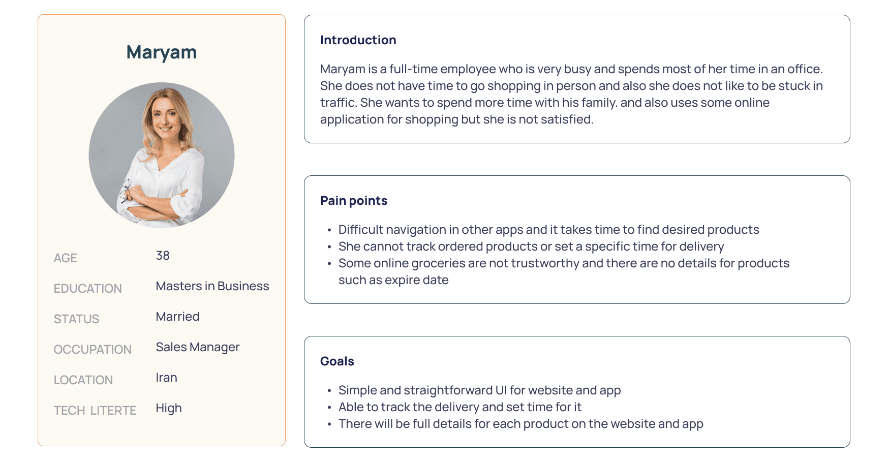
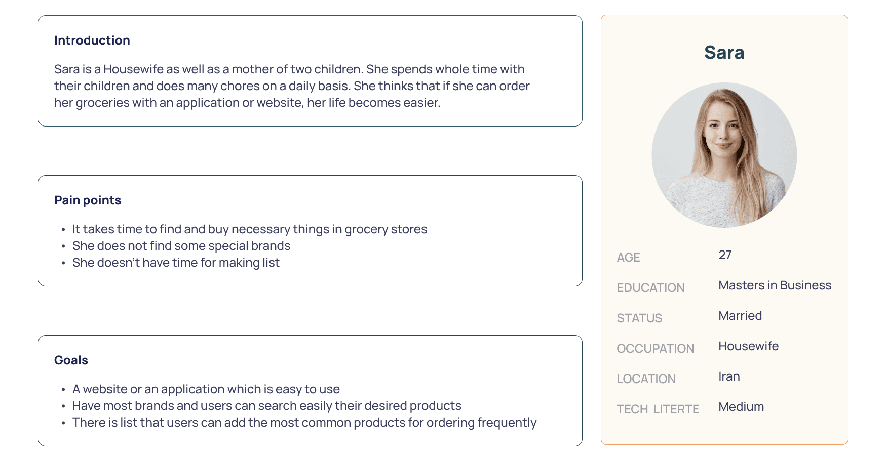
Persona
With the data which collected from research step (survey and interviews), I created two personas that helped me find better solutions because it gave me an in-depth understanding of the user goals and their pain points.
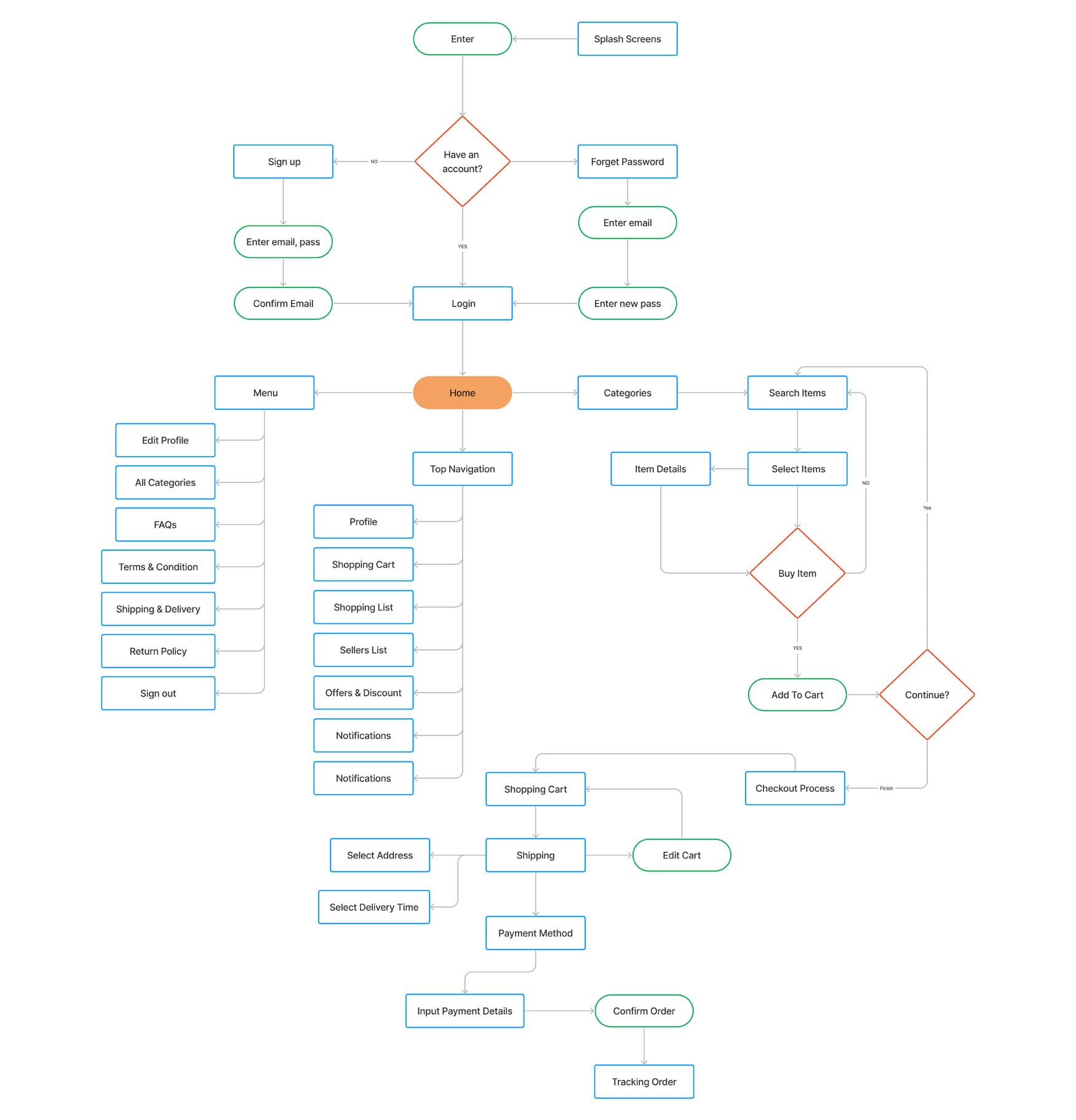
UserFlow
User flow reflects the user's progress from the launch of application or website to the discovery all screens or pages in the app or website and also User Flow helps to identify the needs a user will have when interacting with the product being designed.
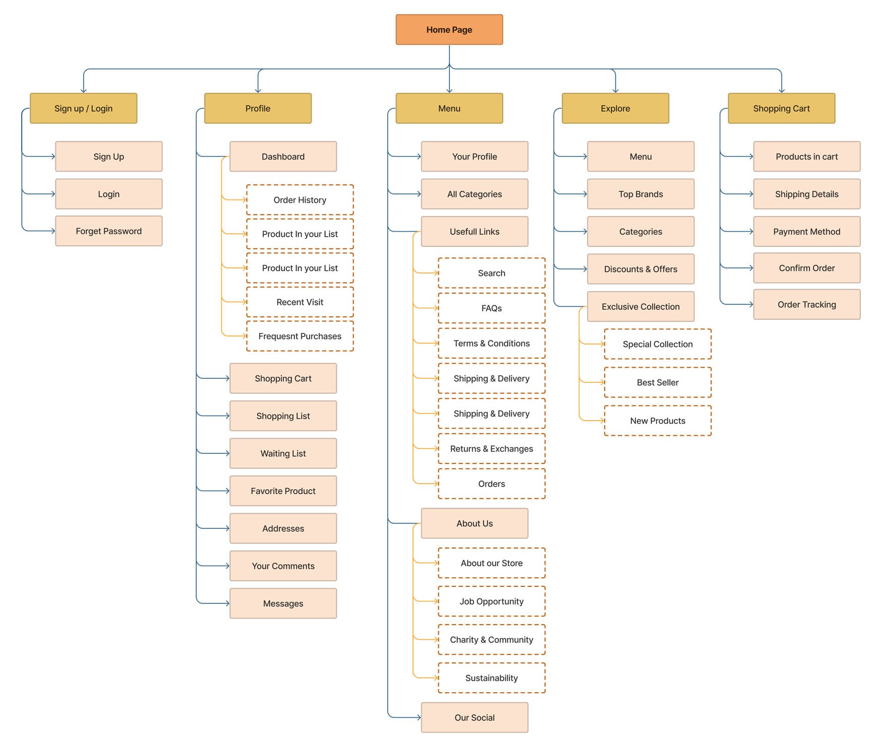
Sitemap
A sitemap helps me to visualize the relationship between the content and examine the hierarchy. I tried to keep the sitemap simple and straightforward, which will make the future maintenence easier.
User Journey Map
A visual presentation of the user's journey accross all touchpoints of the application was made to understand where we can improve the user experience.
Mid-Fidelity Prototype
Mid-fidelity prototypes give people a better sense of what the solution or part of the solution might look like and I also tested and validated some early assumptions.
Usability Testing
After the first prototyping was completed, I tested the prototype with six representative users to see how the application and website are user friendly.
Conduct Usability Testing
The test was conducted over google meet video calls where the participant were given the following tasks while I observed how they navigated through the website or application.
- Make an account and sign in
- Use search option and find some product
- Choose product and add to your cart
- Finish checkout process
- Add some comments for a product
- Reorder one of your previous orders
I wrote down their mistakes, slips, and confusions they expressed in the process. This transcript is a perfect raw material for summarizing the patterns of user’s interaction with the prototype.
Suggestion to make the experience better
- Simplify the registration page (website)
- Increasing the font size (application)
- Add some feature to register orders faster (website - application)
- Improve the save list page (website)
- Recieve some feedback from users when they finished chekout process
Style Guide
UI KIT
High-Fidelity Prototype