Food Court Web App on an interactive touch screen kiosk
Design intelligent food ordering system with an interactive touch screen kiosk or tablet.
Project Overview
Overview:
The Complete Food Court Management Software consists of two interconnected systems.
1. Intelligent food ordering system with an interactive touch screen kiosk or tablet.
2. Order receiving system and warehouse management
Note: On this page, I designed the first case based on user research, user needs and priorities.
Touch screen kiosk for taking food orders has a great effect on reducing customer order time and cost. In addition, it prevents errors and it makes a sense of satisfaction in customers.
Problem:
- Most of the time customers have to face the issue of heavy rush at the counter and they have to stand in a long queue before their turn comes to place an order. (It’s time-consuming)
- It may happen that customer stand in a long queue in a food court and then when their turn comes to place order, they discover that the food item they want to order is not available. (Knowing about food availability)
This leads to lots of frustration in the customers and their valuable time and energy is just wasted.
Goal:
Therefore, my primary goal was to create a design that is friendly and time-saving for people who:
- don't want to wait in line to order food.
- tend to know more about details of food and see some real picture of it
- want to help environment by reducing paper consumption
- want to pay in different way
Duration:
3 weeks
My Role:
User research, Interaction design, Develop
Tools:
Figma, FigJam, Adobe Photoshop, Illustrator, Zeplin
Design Process
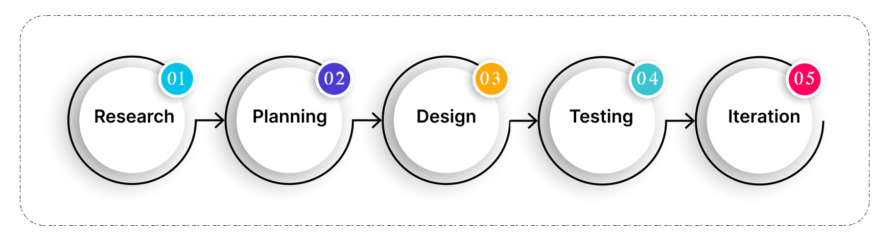
1. Research
Research Plan
To understand the user’s need, I interview 10 users. I used this method to collect in-depth information on people's opinions, thoughts, experiences, and feelings. I interview with users in person and asked a series of open-ended questions about their experience and I received detailed responses.
Research goals:
- Identify the target audience of food court
- Get to know about how people choose and pay for food
- Understand the user needs
Methodology:
- Primary Research (User Interview)
Research Synthesis
Empathy Map
To synthesize the qualitative data gathered from user interview, I created an empathy map to identify patterns across users, uncover insights, and generate needs.
Insights:
- Users want to know more about details of each food
- Users look for food which quality matches its price.
- Users prefer digital menu rather than paper one
- Users want to pay only once for all orders
- Users want to reduce the time which should spend in line for ordering
Needs:
- Users need to know better about food's ingredients and content
- Users need to pay for a quality and healthy food
- Users need to make sure about availability of food
- Users need to pay in the same way for all orders easily and quickly
- Users need to select and order their favorite foods in one place (with an interactive touch screen kiosk)
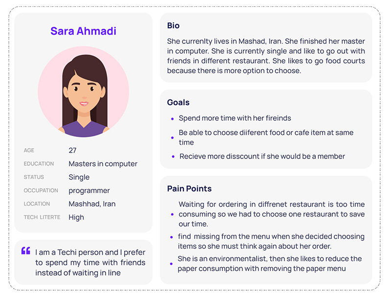
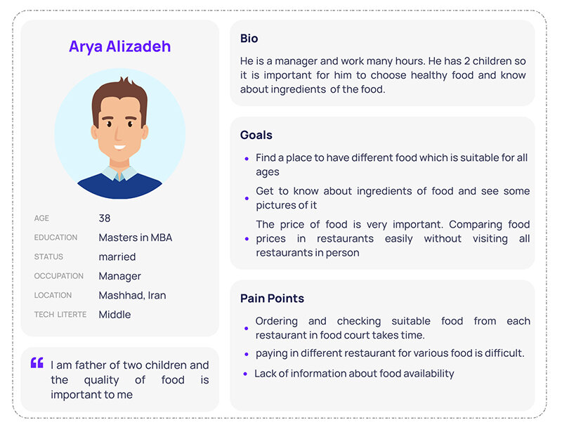
Persona
Since I have gathered a bunch of knowledge of the audience, as well as their goals and needs, I use the user persona to represent key audience segments. It helps me focus on tackling the most important problems – to address the major needs of the most important user groups. It is both fictional and realistic.
2. Planning
Our Challenge:
After analyzing all of our research, I started to understand our main project’s challenge:
How to make the process of ordering food in the food court easier and faster for users?
The Solution:
To overcome these obstacles, we need an interactive touch screen kiosk with a web application that is simple and user-friendly.
3. Design
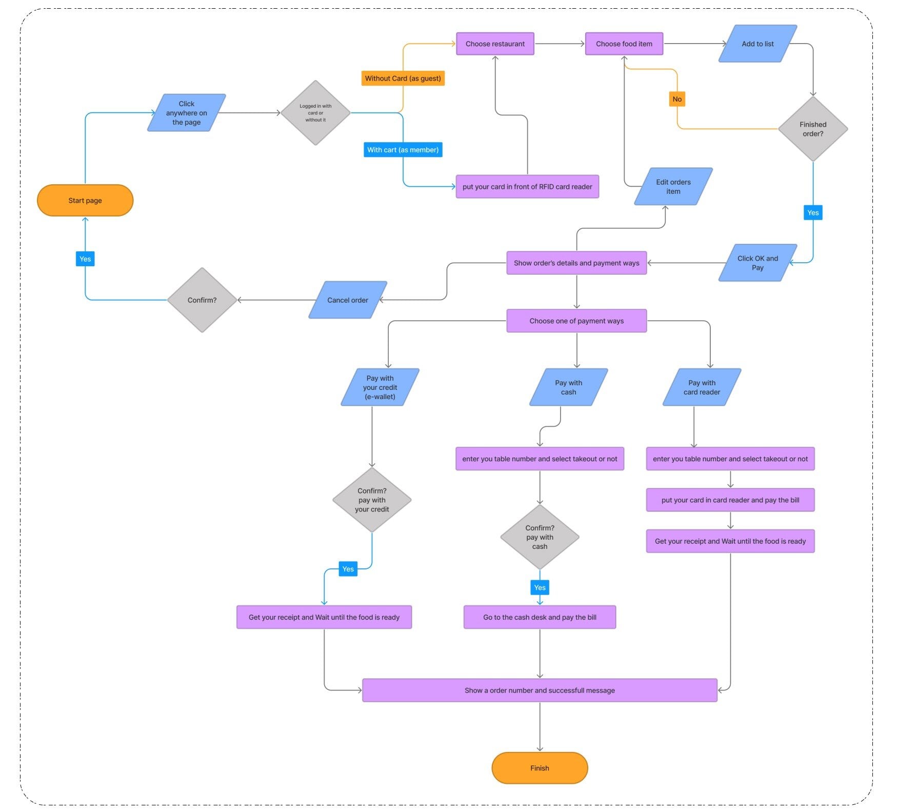
User Flow
I use information to learned about potential users. User Flow help identify the needs a user will have when interacting with the product being designed. To outline this process, I created a user flow.
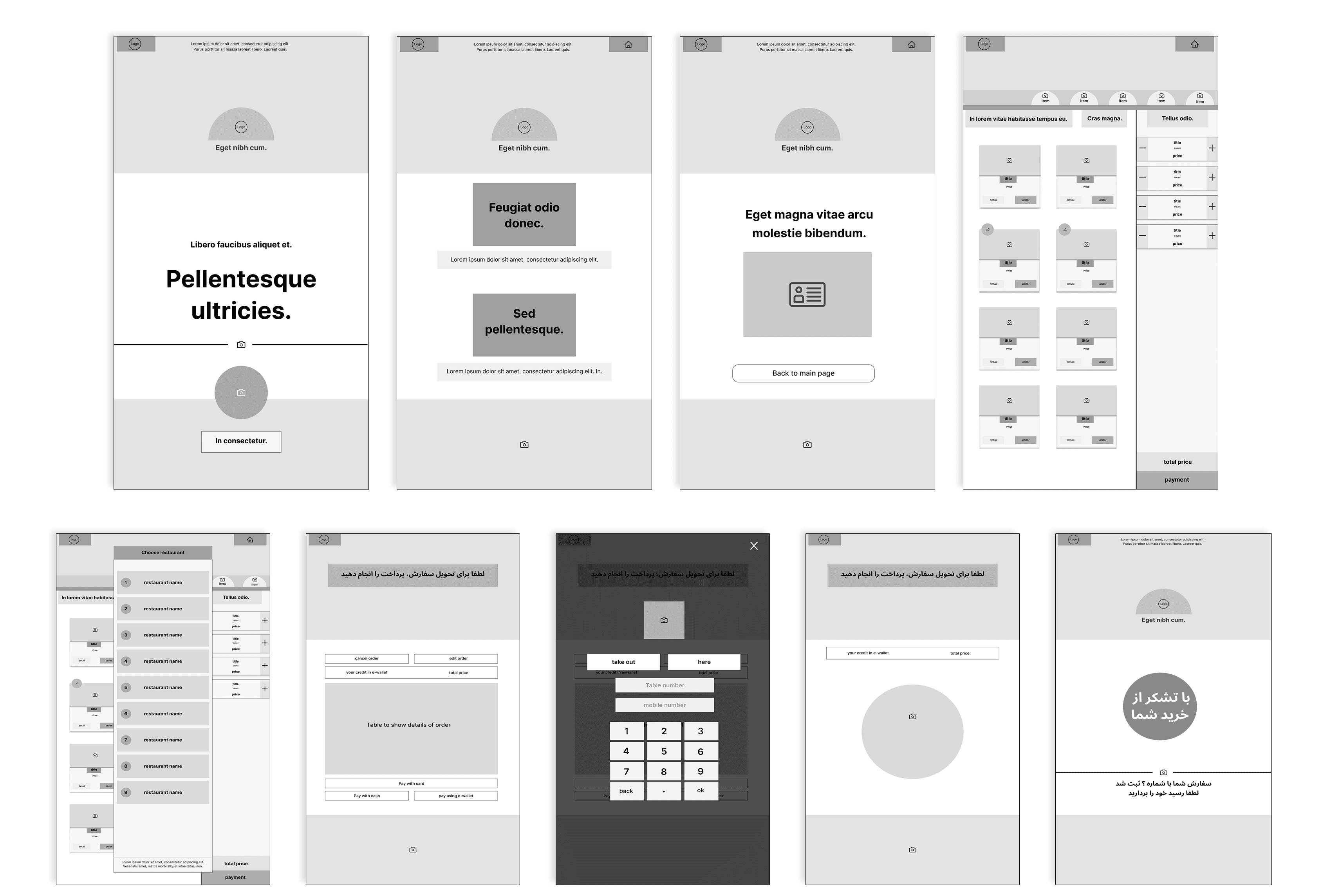
Wireframe
Mid-Fidelity Prototype
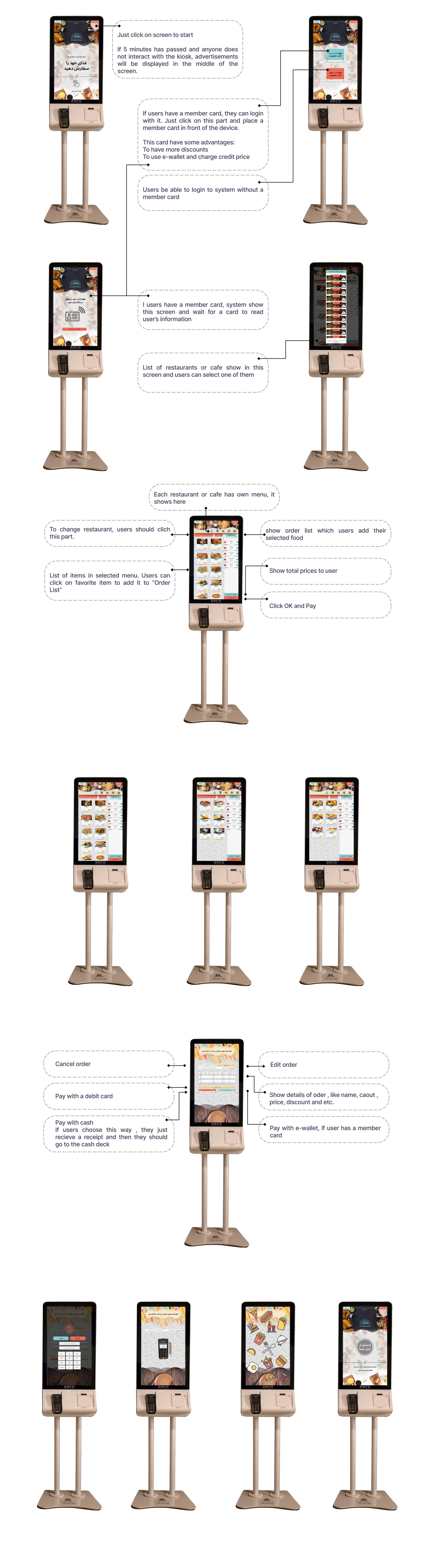
Creating a mid-fidelity prototype is so beneficial for recognize some problems before spending too much time on details. The mid-fidelity prototype was created by Figma application.
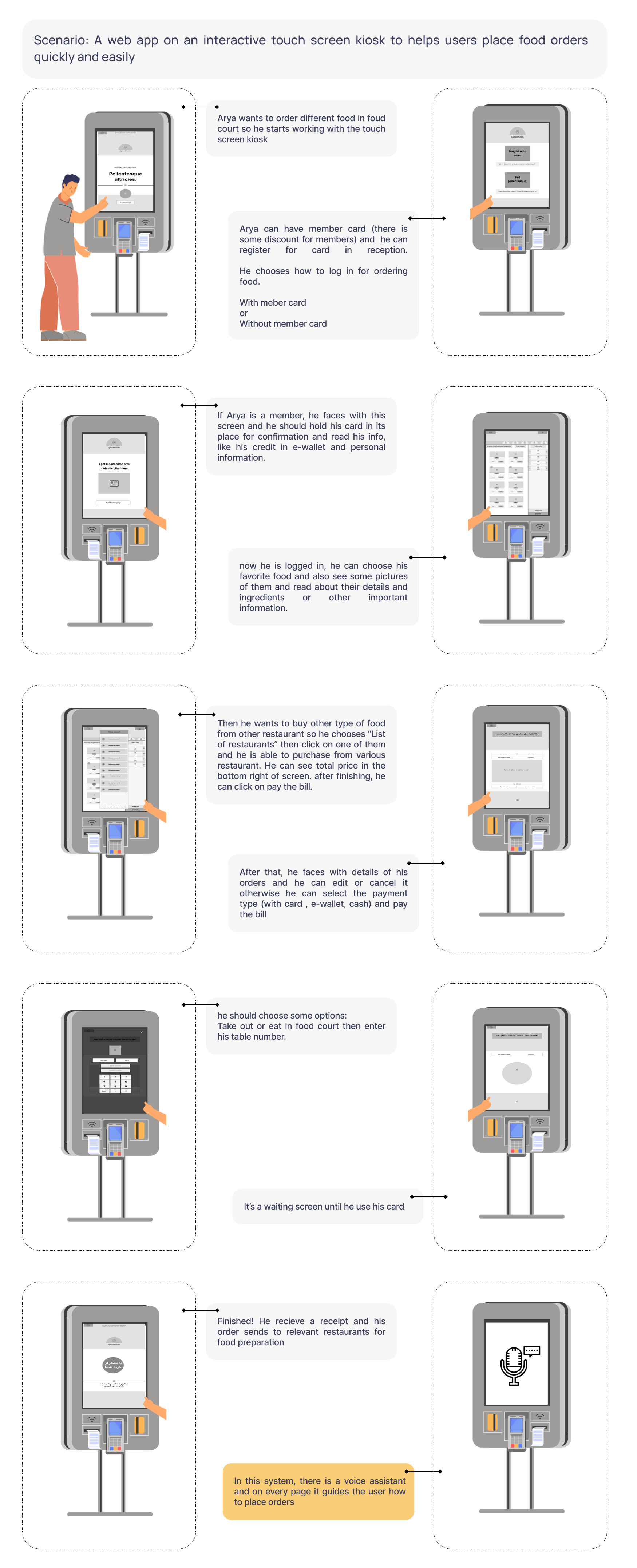
A close-up storyboard
I created a close-up storyboard for each each panel which focus on the product and I try to show the answers of thses questions:
Think about questions like,
- What happens on each screen of the product?
- What does the user do to transition from one screen to another?
- after you've created the storyboard, what are potential problems with the flow?
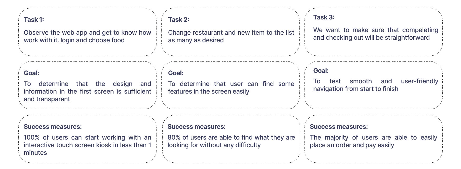
4. Testing
The Prototype was tested by 12 people. (People from different age and gender groups and disabled people were selected.)
5. Iteration
The usability tests were cunducted and a few changes were made.
Listed below are those changes.
- I decided to add to option for recieving food when the users want to enter their table number, they can choose eat their food in food court or take out
- Some users had difficulty to find other restaurant, so I change the style and size of button
- according to the useability test some users want to see the total price and payment button to bigger and more specific
- To help some older people, I added a voice assistant in each screen
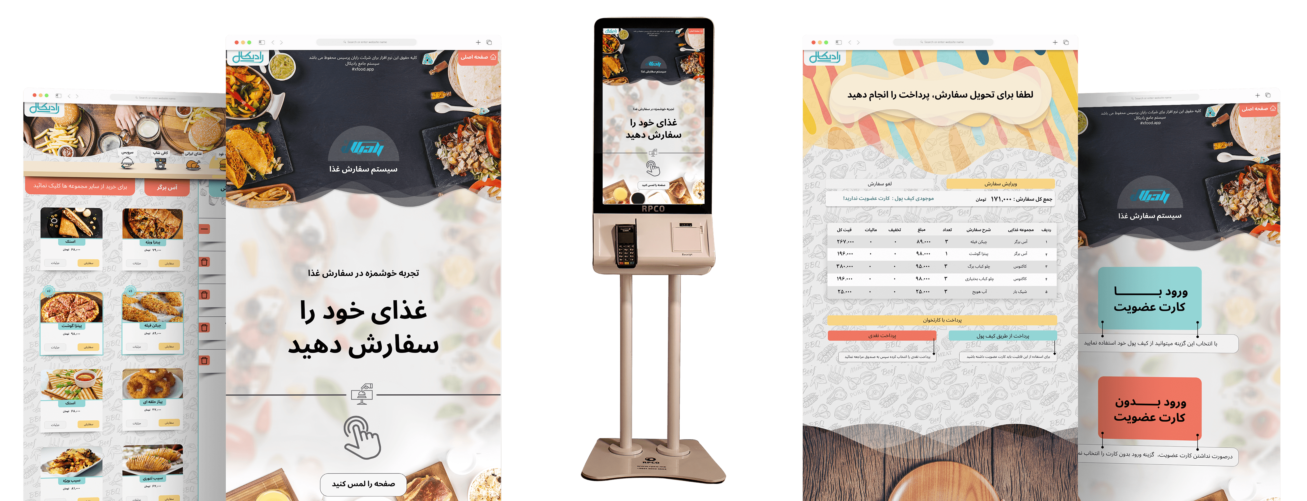
High-Fidelity Wireframes & Prototype
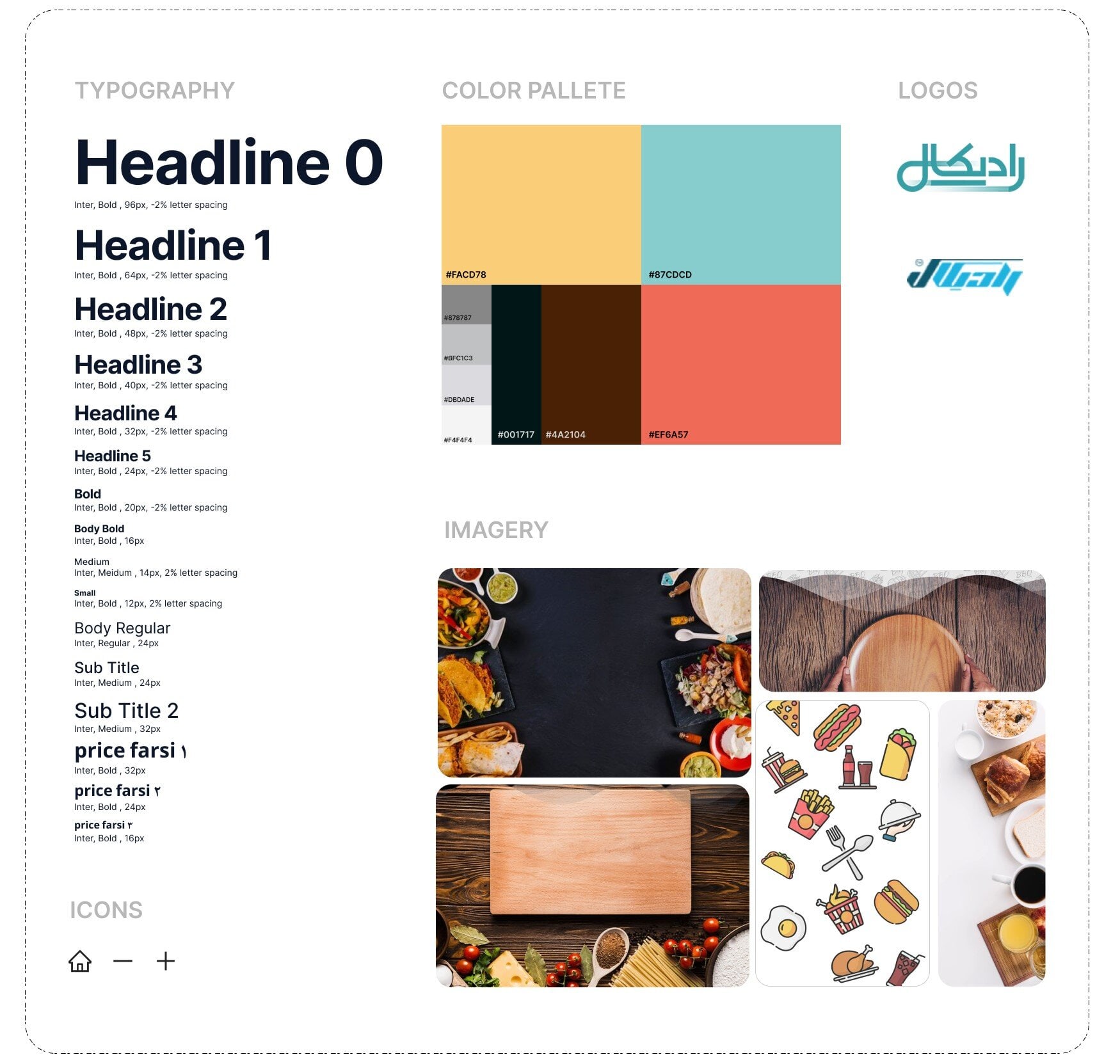
UI Kit
A UI kit, or user interface kit, is a collection of assets that contains a set of design elements such as UI components and styles. UI components are elements that convey meaning and provide functionality to users.
High-fidelity prototypes
High-fidelity prototypes are detailed, interactive versions of designs that closely match the look and feel of the final product. I created a high-fidelity prototype which have these three pieces:
- visual elements like color, images, icons, and typography.
- navigation to help users move between screens.
- interaction, like gestures and motion, which make the prototype function.
Handoff | Final Thoughts | Next Steps
Final Thoughts
With the final prototype created, I believe that I have met the goals that were outlined in the beginning of the design process. I designed a web app for a food court which increases the speed of placing orders .
Design Implementation & Handoff
It is ready to enter the development phase since the design has been tested and revised. I used Zeplin to handoff my design, it helps to have an effectively communicate with developers.
Next Steps
The next steps would be designing an app for digital menu and connect it to the main system and also create a mobile application for reserving table and ordering food.